Candlestick charts encode the open, high, low and close for each period, and their shapes and sequences form patterns that traders read as potential reversals or continuations. This guide covers the anatomy of a candle, the patterns worth learning first, and the context required to use them.
Candlestick charts show how price moved during a specific period and where buying or selling pressure emerged. Once you know what each part of a candle represents, the rows of coloured bodies and thin wicks resolve into readable information.
The Fundamentals of a Candlestick Chart Explained
A candlestick chart refers to a type of financial chart that displays the price changes of an asset, such as a share, index, currency pair, or commodity, over a period of time. Each candle represents a specific time interval and provides four data points:
- The Opening Price
- The Highest Price
- The Lowest Price
- The Closing Price
These are commonly abbreviated as OHLC: Open, High, Low, Close. The candlestick format was developed in eighteenth-century Japan by a rice trader who wanted a way to visualise the emotions driving rice prices, and it was only introduced to Western markets much more recently. Today it is the default chart type on virtually every trading platform.
How Do Candlestick Charts Work?
Reading these charts starts with the anatomy of a single candle.
The Body
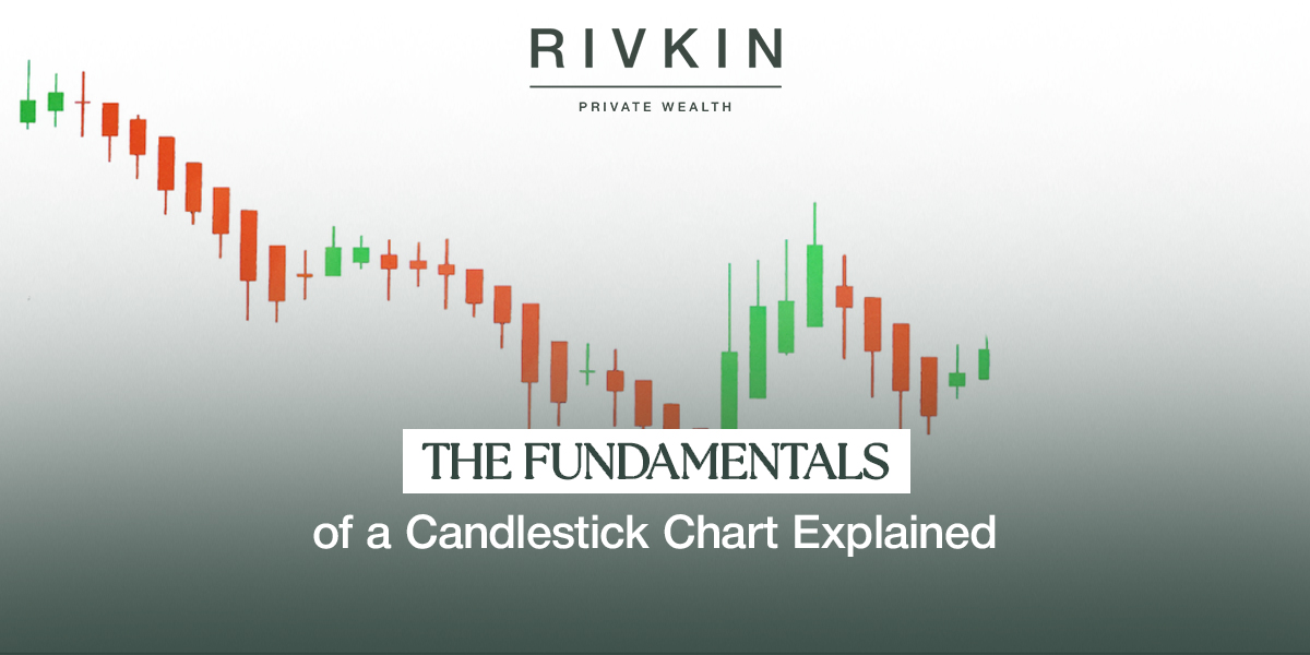
The rectangular part of the candle shows the range between the opening and closing prices. A green or white body means the close was above the open, so buyers controlled the period. A red or black body means the close was below the open.
The Wicks (Shadows)
The thin lines above and below the body are wicks, or shadows. The top wick marks the highest price reached during the period and the bottom wick the lowest. Long wicks show price volatility within the period even where the close finished near the open.
Timeframes
Each candle covers one full period. On a daily chart, one candle is one trading day. On an intraday chart, it might cover a few minutes. The same patterns apply across all timeframes, and patterns on daily and weekly charts are generally treated as more reliable than intraday ones.
Candlestick Components at a Glance
| Component | What It Shows | Bullish Signal | Bearish Signal |
| Body (large) | Strong directional conviction | Large green body | Large red body |
| Body (small) | Indecision or consolidation | Small green body | Small red body |
| Upper wick (long) | Price reached higher but was rejected | Neutral, context matters | Selling pressure from highs |
| Lower wick (long) | Price fell, but buyers stepped in | Buying support from lows | Neutral, context matters |
| No wick (Marubozu) | Price moved cleanly from open to close | Full bullish Marubozu | Full bearish Marubozu |
Key Candlestick Patterns for Beginners
The most common patterns are single-candle and two-candle formations, each describing the balance between buyers and sellers. Pattern scanners running across the ASX All Ordinaries flag dozens of distinct formations across timeframes from a few minutes to a full month, which indicates how frequently these shapes appear.
The Doji
A Doji forms when the open and close are almost identical, leaving a tiny or non-existent body. The candle resembles a cross. It signals indecision, with neither buyers nor sellers establishing control. A Doji appearing after a strong trend can be an early warning of a reversal.
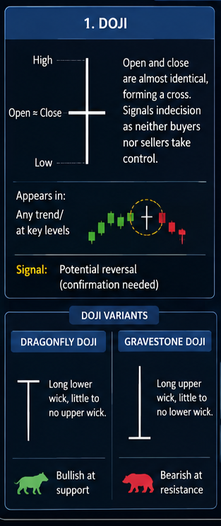
The Dragonfly Doji, with a long lower wick and little to no upper wick, and the Gravestone Doji, its mirror image, carry more specific bullish or bearish implications depending on where they appear. Context governs: a Doji mid-trend carries less weight than one at a major support or resistance level.
The Hammer
The Hammer has a small body at the top of the candle and a long lower wick. It forms in downtrends and shows that sellers pushed the price down during the period before buyers drove it back to near the open. Traders read that rejection of lower prices as a bullish reversal signal, particularly when a strong green candle confirms it in the following period.
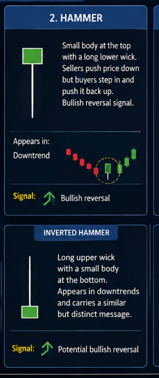
The Inverted Hammer carries the long wick on top instead and appears in a similar downtrend context.
The Shooting Star
The Shooting Star is the mirror image of the Hammer, with a small body at the bottom and a long upper wick. It appears in uptrends and shows that buyers pushed the price up sharply before sellers drove it back to near the open. A Shooting Star at a resistance level, confirmed by a red candle in the next session, is a bearish reversal signal.
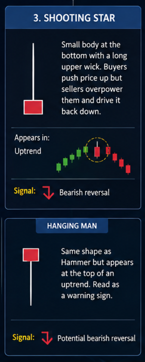
The Hanging Man shares the same shape but appears at the top of an uptrend rather than within one, and traders read it as a comparable warning.
Bullish Engulfing
A two-candle pattern. A small red candle is followed by a large green candle whose body completely covers the body of the red candle. It signals a shift from sellers to buyers. Bullish Engulfing patterns carry the most weight at the bottom of a downtrend, particularly at key support levels and on above-average volume.
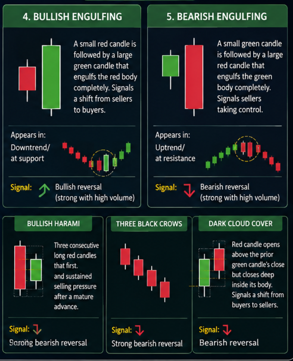
The Bullish Harami is the gentler version, where the second candle sits entirely inside the first rather than swallowing it. It suggests momentum is stalling rather than reversing.
Bearish Engulfing
The reverse of the Bullish Engulfing. A small green candle is followed by a large red candle that engulfs the green body entirely. It signals that sellers have overwhelmed buyers, and applies at the top of an uptrend or at resistance. Confirmation from the next candle and from volume strengthens the signal.
Stronger multi-candle versions include Three Black Crows, three consecutive long red candles indicating sustained selling, and Dark Cloud Cover, where a red candle opens above the prior green candle’s close and finishes deep inside its body.
Candlestick interpretation is one component of a broader technical analysis toolkit. The Rivkin Report combines technical and fundamental research on ASX and US equities. Read our latest insights.
How to Use Candlestick Patterns Effectively
The context in which a pattern appears carries as much weight as the pattern itself.
Confirm with Volume
A bullish engulfing pattern on heavier-than-usual volume carries more weight than the same pattern on thin volume. Volume indicates that buying or selling pressure is behind the price movement.
Use Support and Resistance Levels
A Hammer forming at a historically significant support level is a stronger signal than one forming in the middle of a trading range. Combining candlestick patterns with support, resistance and trend lines improves their reliability.
Wait for Confirmation
Single candlestick patterns carry more weight when the following candle confirms them. If a Hammer appears, wait for the next candle to open and close above the Hammer’s high before acting. Acting on the pattern candle alone is where false signals cost money.
Frequently Asked Questions
Are candlestick patterns reliable?
They carry statistically measurable predictive value, particularly on longer timeframes and at significant price levels. No pattern is reliable in isolation. They work best combined with volume analysis, trend identification, and support and resistance levels.
What is the most important candlestick pattern?
For beginners, the Hammer and the Engulfing patterns. They are straightforward to identify, appear frequently, and carry clear entry and risk management rules. The Doji is worth learning as a signal of indecision and potential trend change.
Which timeframe should I use?
Daily charts suit most investors and swing traders. Intraday charts carry more noise and more false signals. Start on daily charts and move to shorter timeframes as your pattern recognition develops.
Conclusion
The foundational candlestick patterns take little time to learn. The skill sits in reading what those shapes say about the balance between buyers and sellers at that moment, and in requiring confirmation before acting. Combined with volume, key levels and consistent risk management, candlestick analysis is a usable input to a trading process.
The Rivkin Report provides independent research and market commentary across ASX and US markets for self-directed investors.

